Wind & Solar Power are Like Graphite; Nuclear Power is Like Diamonds
Meet Edgardo Sepulveda & Consider his Radial Graphs
This article is a collaboration. Edgardo Sepulveda, a regulatory consulting economist working in Toronto, Canada, posted a marvelous thread on Twitter that I am re-publishing here, following this introduction.
Fungibility
One of the most useful words I learned in law school is fungible. It comes up in commercial contexts, such as contracts and, especially, Article 9 of the Uniform Commercial Code involving security interests in goods. Generally, all commodities are fungible. One ton of wheat or coal or washed sand is the same as any other. Buyers and sellers of commodities can easily find substitutions
Fungibility need not be literal, depending on the facts:
Scenario 1: Assume I own a coal mining company and have a contract with a cement manufacturer to deliver 5,000 tons of X-BTU thermal coal per month. I secure a low-cost supply of tire-derived fuel (TDF) for a lower cost. If the buyer’s pollution control and other costs are equivalent, I may substitute the BTU-equivalent volume of TDF for the coal without breaching my contract.
Scenario 2: Same assumptions except the buyer is using the coal to make coke. I may not substitute TDF because it won’t make coke. Doing so would breach my contract.
While graphite and diamonds are literally comprised of the same element (pure carbon), they are in no way fungible.
Four Ways of Measuring Energy
Hannah Richie, Ph.D (GeoSciences, University of Edinburgh), Head of Research, www.ourworldindata.org, created a particularly good webpage describing metrics used to measure energy with a visualization.
The differences between the first stage (‘primary energy’) and the last (‘useful energy’) can be very large. This means it’s important to be clear about which metric is being referred to when people speak about data on “energy”.
This all seems intuitive but I want to focus on the final column.
Useful energy: This is the last step. It is the energy that goes towards the desired output of the end-use application. For a lightbulb, it’s the amount of light that is produced. For a car, it’s the amount of kinetic (movement) energy that is produced.
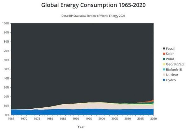
We live in an electric world. Most of the energy we see and use is electrical. But electric energy is almost trivial compared to the energy that feeds, clothes, and shelters us. What is the 85% of non-electrical energy?
Two engines perform most of Civilization’s work: The Diesel Engine and the Jet Engine. These two engines, and the systems required to create energy-dense, liquid fuels for them (diesel fuel and kerosene) represent the backbone of the 85%, without which most of the 8 billion people on the planet would die in short order.
Civilization's entire industrial and agricultural base is 100% dependent on "heavy distillates" (diesel-kerosene-jet fuel-tar-bunker-heating). Imagine a world without:
Farming equipment
Ships
Jet aircraft
Locomotives - trains
Mining equipment
Long-haul trucks
Construction equipment
Diesel generators
Drilling equipment
Heavy distillates are like Civilization’s blood and the leftover gasoline-petrol is like skim milk. Crude oil makes a lot more gasoline than heavy distillates, which is a precious form of chemical energy battery. Do not waste heavy distillates. Diesel and jet engines, combined with hydraulic fluid, perform perhaps 85% of all civilization’s work. Without these engines, we would be reliant on manual labor, horses, mules, oxen, water-wheels, and sailboats. Diesel and jet fuel, hydraulic fluid, and lubricating oil are Civilization’s Life Blood. Protect it. Preserve it.
Electrical energy service and heavy distilates are even less fungible than diamonds and graphite.
Crude oil and its products are quintessential commodities, the most useful form of energy to humans for most desired outputs. Imagine having a machine that just produced jet and diesel fuel all day from thin air. It would be the most valuable machine on the planet.
Electricity is in no way a commodity. It is a service that must be consumed in the same nanosecond that it is generated. Alternating current moves at 60 cycles per second or 60 hertz. It’s like a continuous stream.
“Electricity is not a commodity like any other—it is a public service.”
Jacques Percebois, energy economist and professor emeritus at the University of Montpellier, southern France, and director of France's Energy Economics Institute, Le Monde.
Storing electric current is extremely difficult, a phenomenon Ben Franklin described in the 18th Century. Storing and containing electrical energy is devilishly hard—in fact, impossible. It just kept leaking out no matter how he tried to contain it:
For all its usefulness, the inability to store of electrical energy for use later is its weakest attribute. It is always most efficient—by a long ways—to be able to generate electricity at the exact moment it is consumed. Thus, electrical generation resources vary widely in their cost and utility.
Meet Edgardo Sepulveda
My name is Edgardo Sepulveda. I am a regulatory consulting economist, initially in the telecoms sector. I was born in Chile, but have been in Toronto, Canada for the last 25+ years. I started learning and writing about the energy sector about 6 years ago, with a focus on regulation and economics.
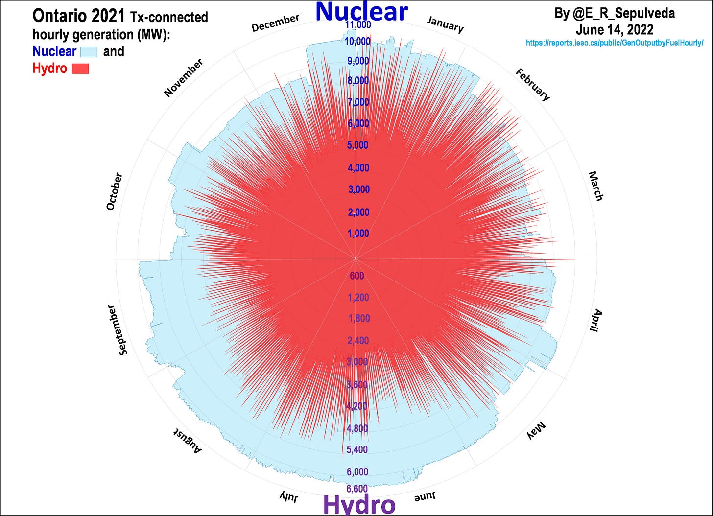
Ever wonder what dispatchable vs. intermittent electricity generation looks like? #energytwitter Inspired by @TristanKamin, I charted hourly 2021 data (8,760 points) for Ontario, Canada. I started with two largest sources, Nuclear (57% of mix) and Hydro (24%), scaled accordingly.
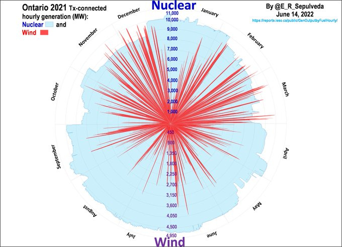
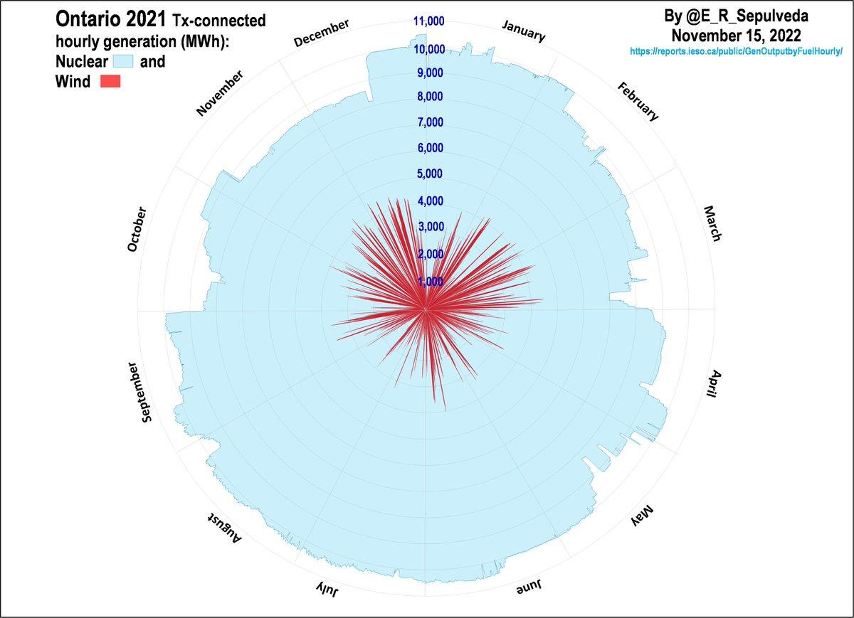
How does Wind (9% of mix) look? With Nuclear on scaled on the graphic. Wind has “wind droughts," day-to-day and seasonal variation. Wind produces ≈ 30-35% of theoretical capacity (CF); Nuclear≈85-90%, Hydro≈40-45%.
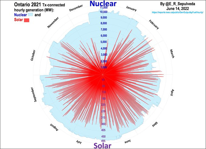
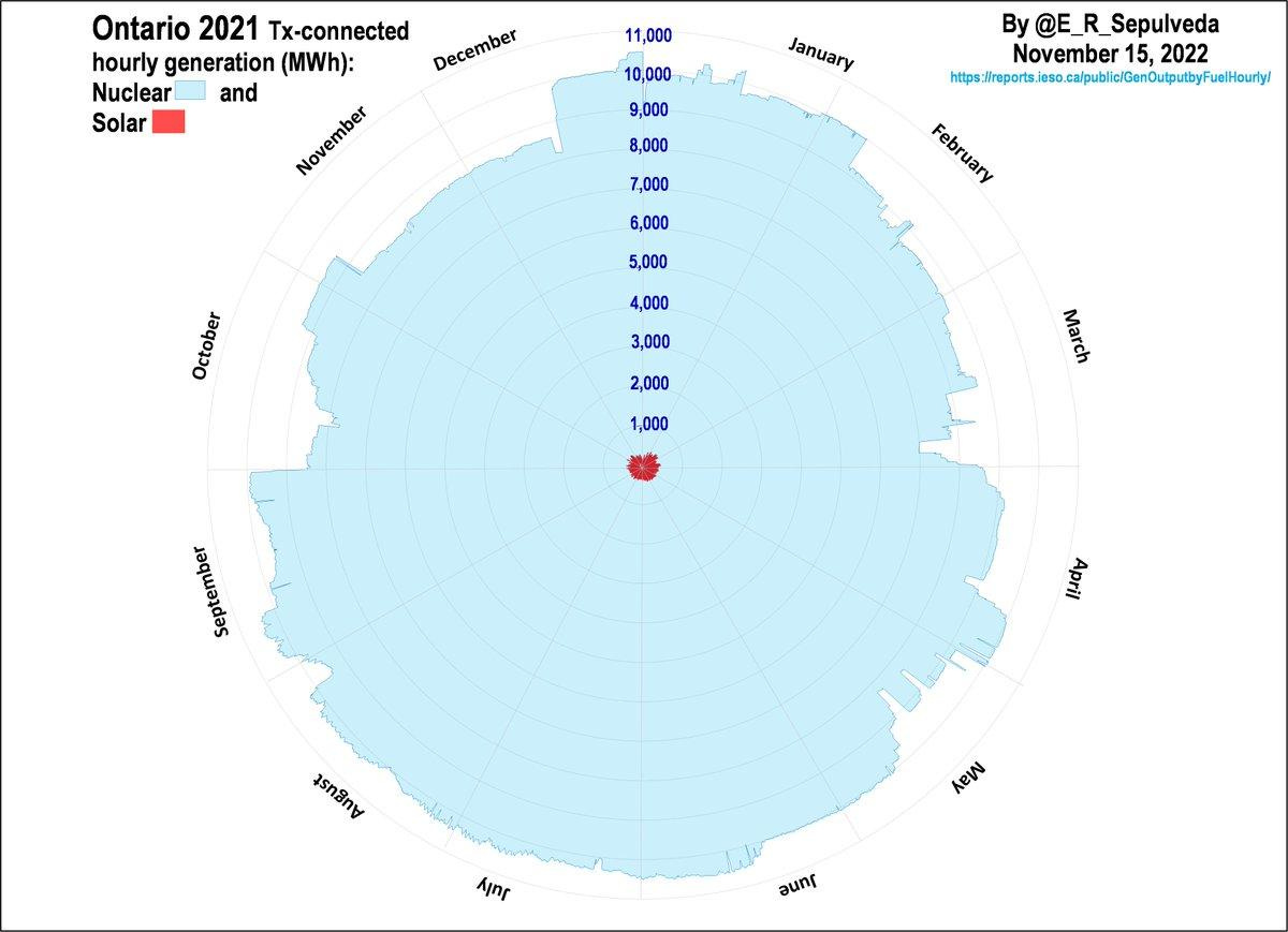
The scaled graph shows Solar (2% of mix) has seasonal (weakest in winter), and day-to-night variation so CF≈15% Intermittent non-dispatchables require “backup,” a role currently played by gas (≈6%) in Ontario.
Based on interest and feedback, I continued with the graphs. One recurring question is choice of scaling. For example, the original graph shows nuclear and wind on different scales.
In Canada, provinces set electricity policy. Ontario is largest (pop≈15 million), with low emissions (≈25-50 gCO2/kWh), due to legacy nuclear and hydro. Gas, wind, solar, biofuel are more recent additions. Ontario has thereby achieved the complete elimination of coal (≈25% in 2003), mostly via restart of some nuclear, with excellent, low-cost service capabilities.
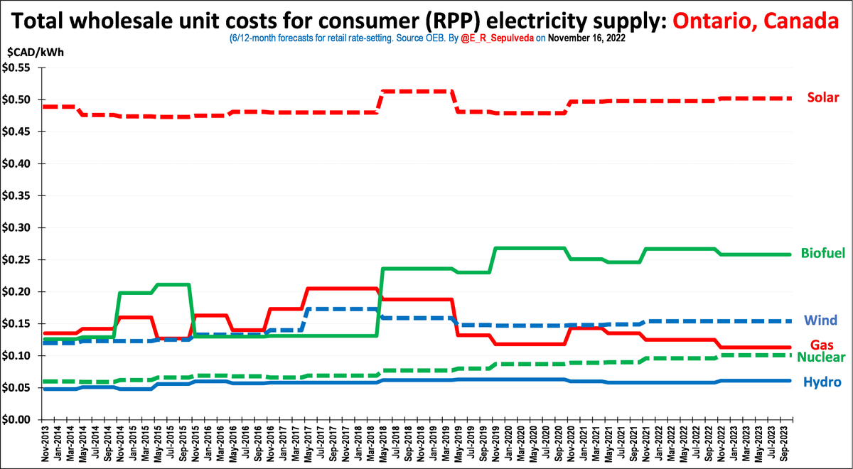
How about costs? The regulations are complex, including expansion agreements, Power Purchase Agreements (PPAs) for gas, and feed-in-tariffs (FITs) for wind, solar, and biofuels (https://miniurl.be/r-4a18). The following graph shows 10-year evolution of cost mix.
So now we can see context for choice of scale, with left (original) scaled to show 2 maxima in one graph, and right (new) on same scale. Wind has “wind droughts,” day-to-day, and seasonal variations, but this is much more evident in left. The right emphasizes the relative size.
But the reduced intermittency comparability of same-scaling really gets lost for solar in Ontario because of the order of magnitude size differences. The seasonal (and day- to-night) intermittency for solar is evident in left (scaled to show 2 maxima), but lost on the right!
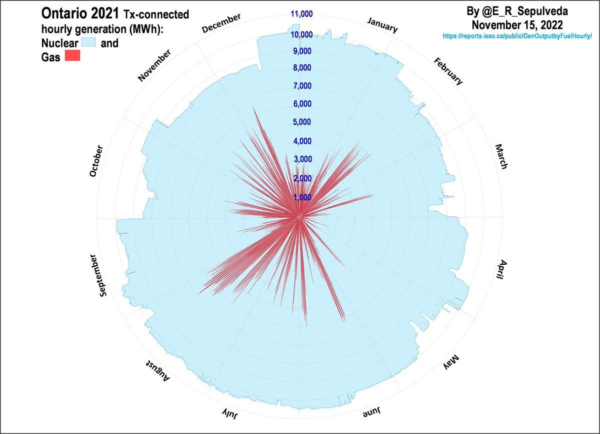
I had already shown hydro before. For completeness here is Gas, scaled, and de-scaled. Gas in Ontario has low volume because use is for peaking and to fill in gaps when when wind and solar are not producing. Check out August during peak summer demand (AC) and a “wind drought.”







great article, looking forward to next ones - just three misprints: Tornto in the message, pubic in the Percebois qote and "intermittency comparibility" pleased to correct it myself in my copy far away in the CZ. Actually, could I translate it for my "same blood-group" friends? Look forward to having any of your works!
The descaled gas graph is missing